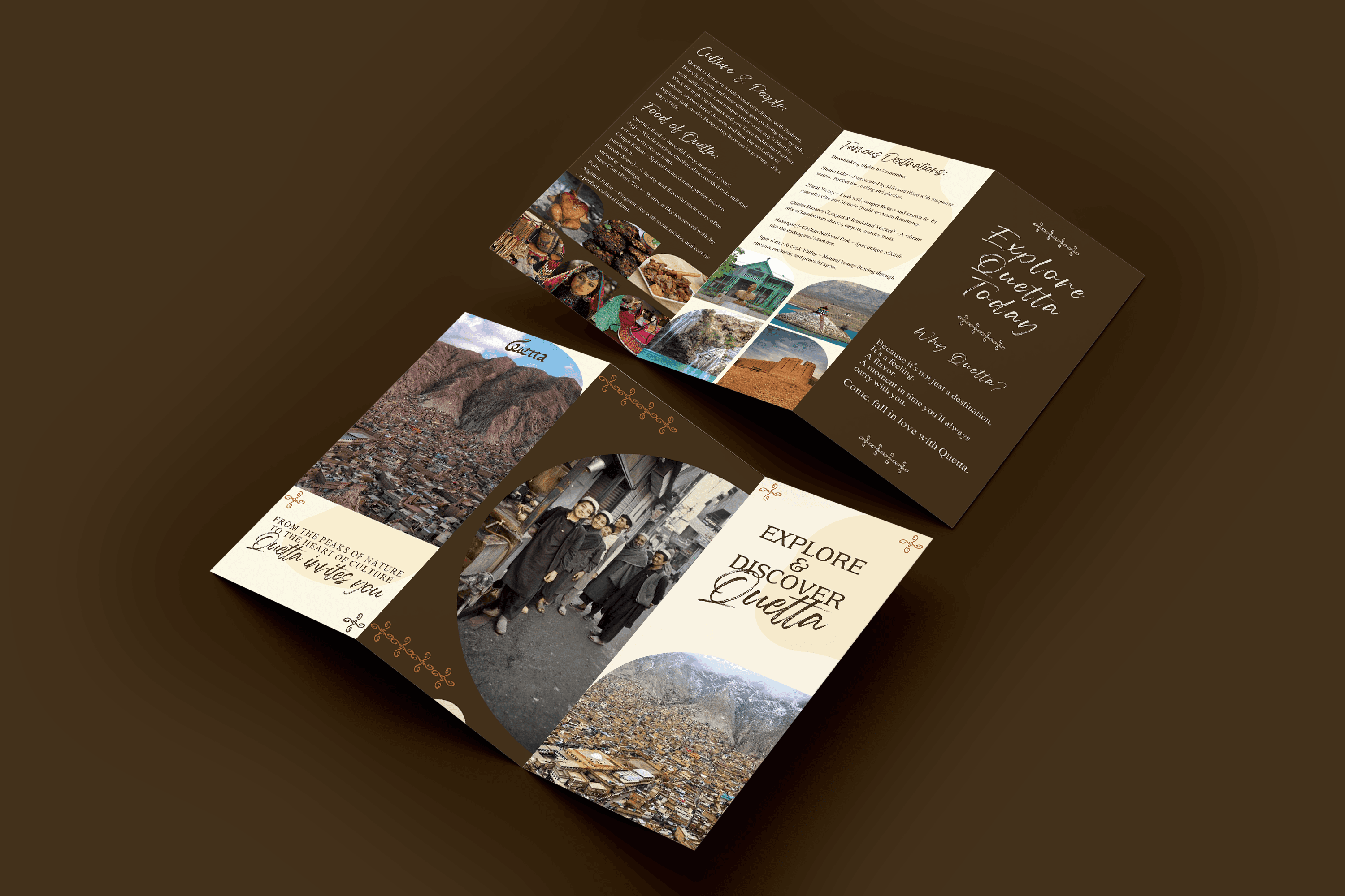
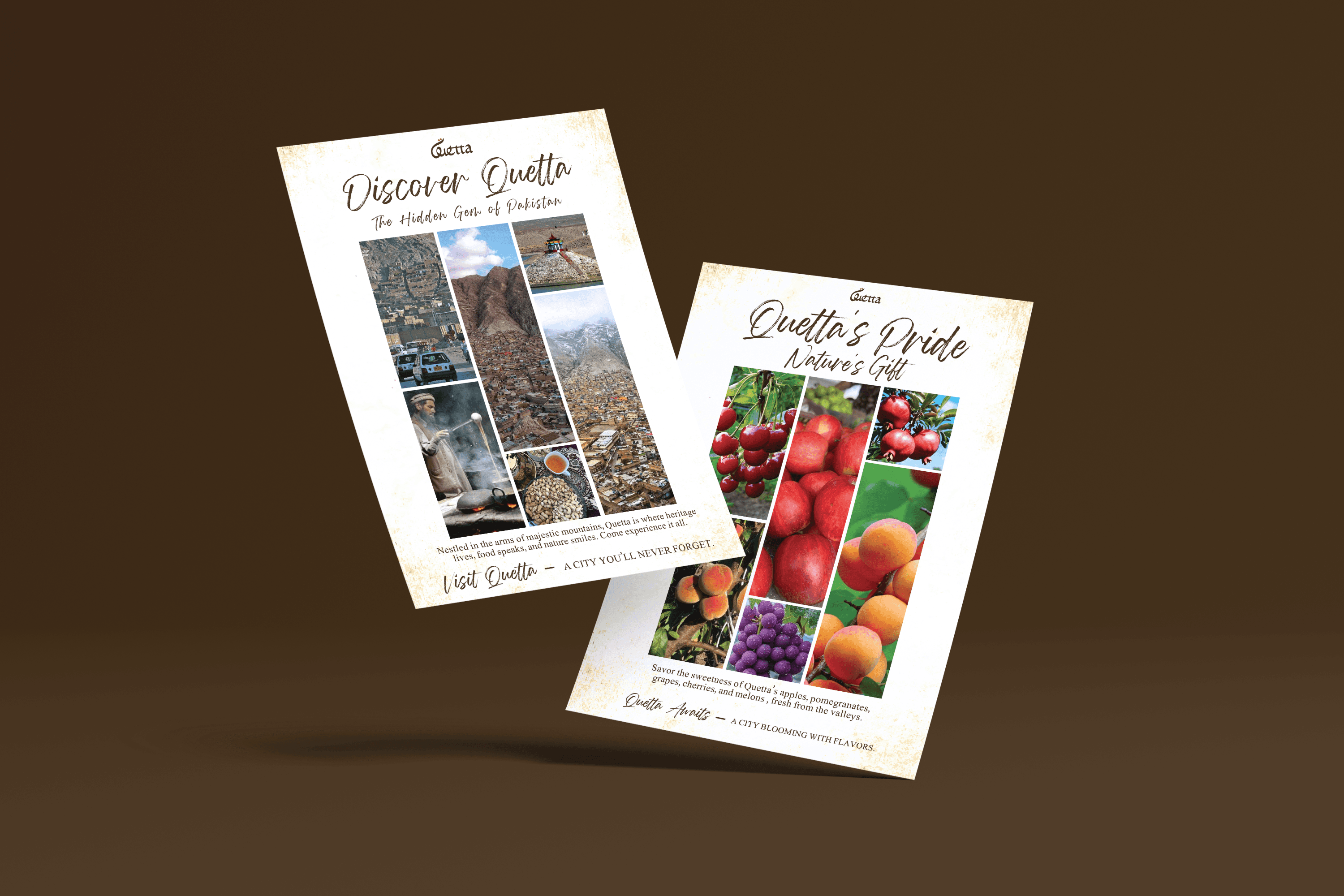
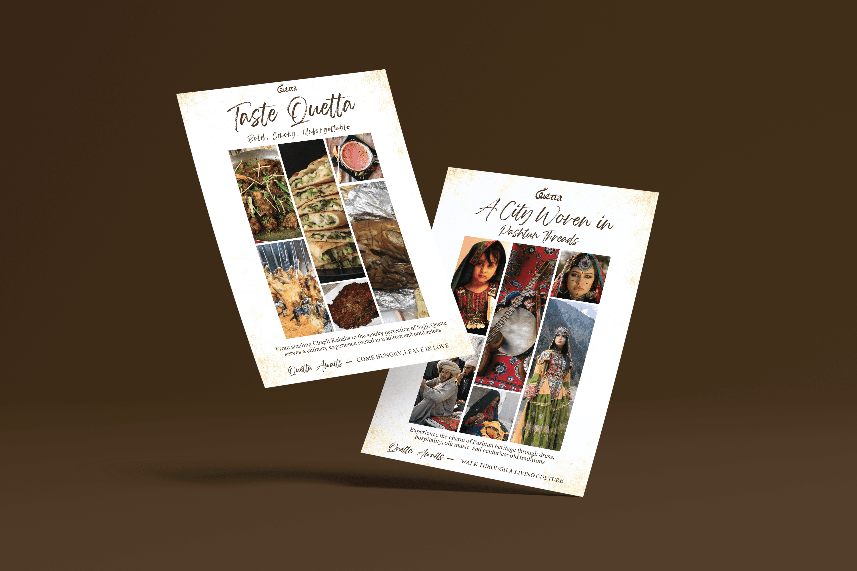
Quetta is a city branding project designed to capture the raw beauty, cultural depth, and natural richness of Quetta, Pakistan.
The goal was to move beyond tourism visuals and create an identity that feels grounded in the city’s landscape, heritage, and everyday life, something that represents Quetta not just as a destination, but as an experience.
THE LOGO
The logo is inspired by the defining elements of Quetta. its mountains, people, and natural simplicity.The flowing form creates a sense of movement and elevation, subtly referencing the surrounding hills and valleys. The two circular elements suggest human connection and community, reinforcing the idea that Quetta is shaped as much by its people as by its geography.
The mark is minimal but symbolic, designed to be easily adaptable across tourism, cultural, and civic applications.
The palette is rooted in earthy, natural tones.
Warm browns and muted neutrals reflect the mountains, soil, and traditional architecture, while also conveying a sense of stability and authenticity. The restrained use of color keeps the identity timeless and avoids the overly vibrant, artificial look often seen in tourism branding.
THE COLOR PALETTE
TYPOGRAPHY
The typography is clean and supportive, allowing the identity to stay focused on its core elements.
A modern, legible typeface ensures clarity across informational and promotional materials, while complementing the organic flow of the logo. The balance keeps the system functional without competing with the visual identity.
THE RESULT
Quetta feels grounded, authentic, and culturally rich.
The identity avoids clichés and instead focuses on what makes the city distinct, its landscape, its people, and its quiet strength. It creates a flexible system that can work across tourism campaigns, cultural promotion, & city representation.
PROJECT OVERVIEW