PROJECT OVERVIEW
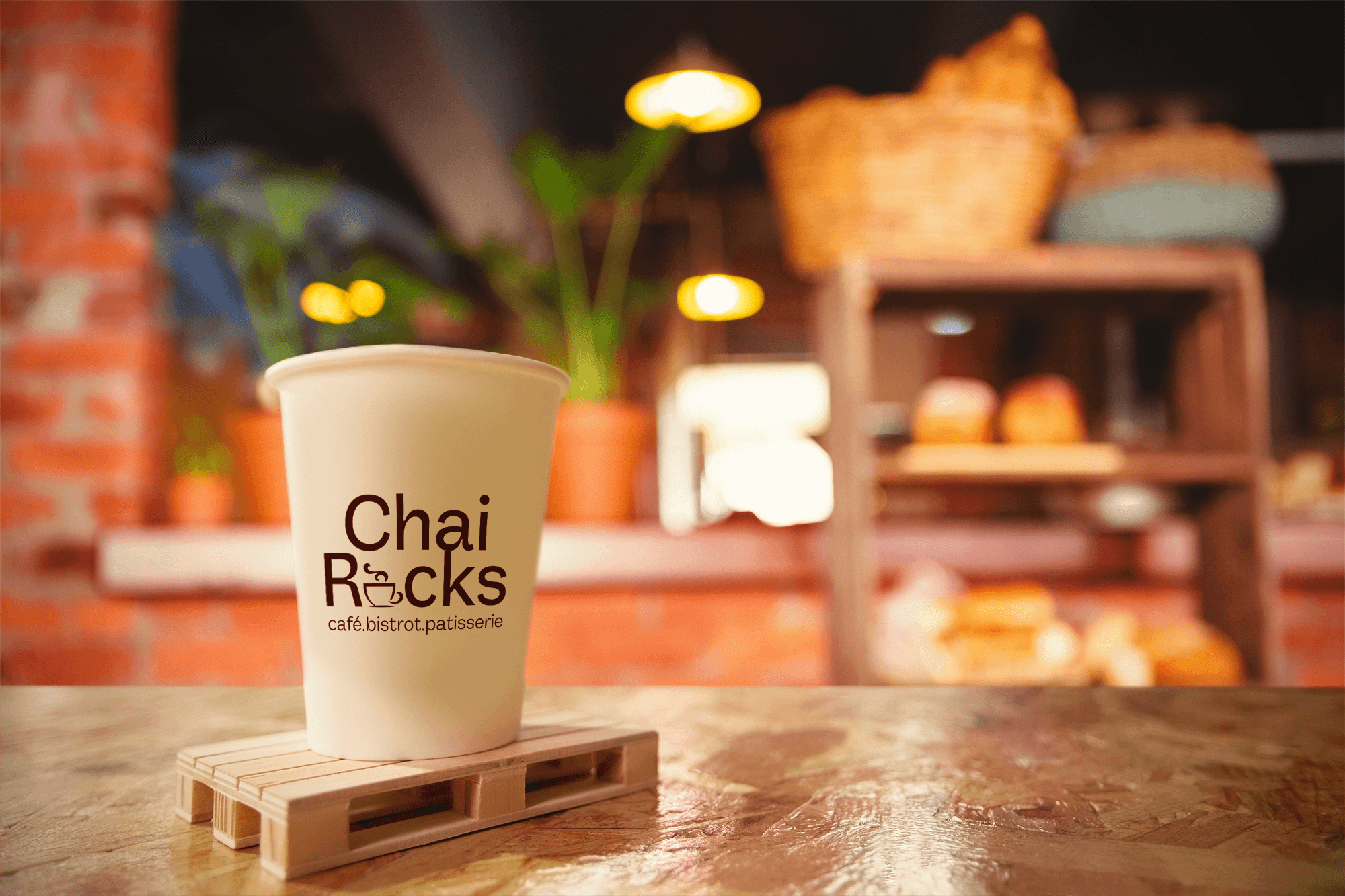
ChaiRocks is a modern café concept blending desi chai culture with a refined, contemporary experience.
The goal of this project was to move away from the typical “overly traditional” chai branding and instead create something minimal, bold, and urban, while still keeping the warmth and familiarity people associate with chai.
THE LOGO
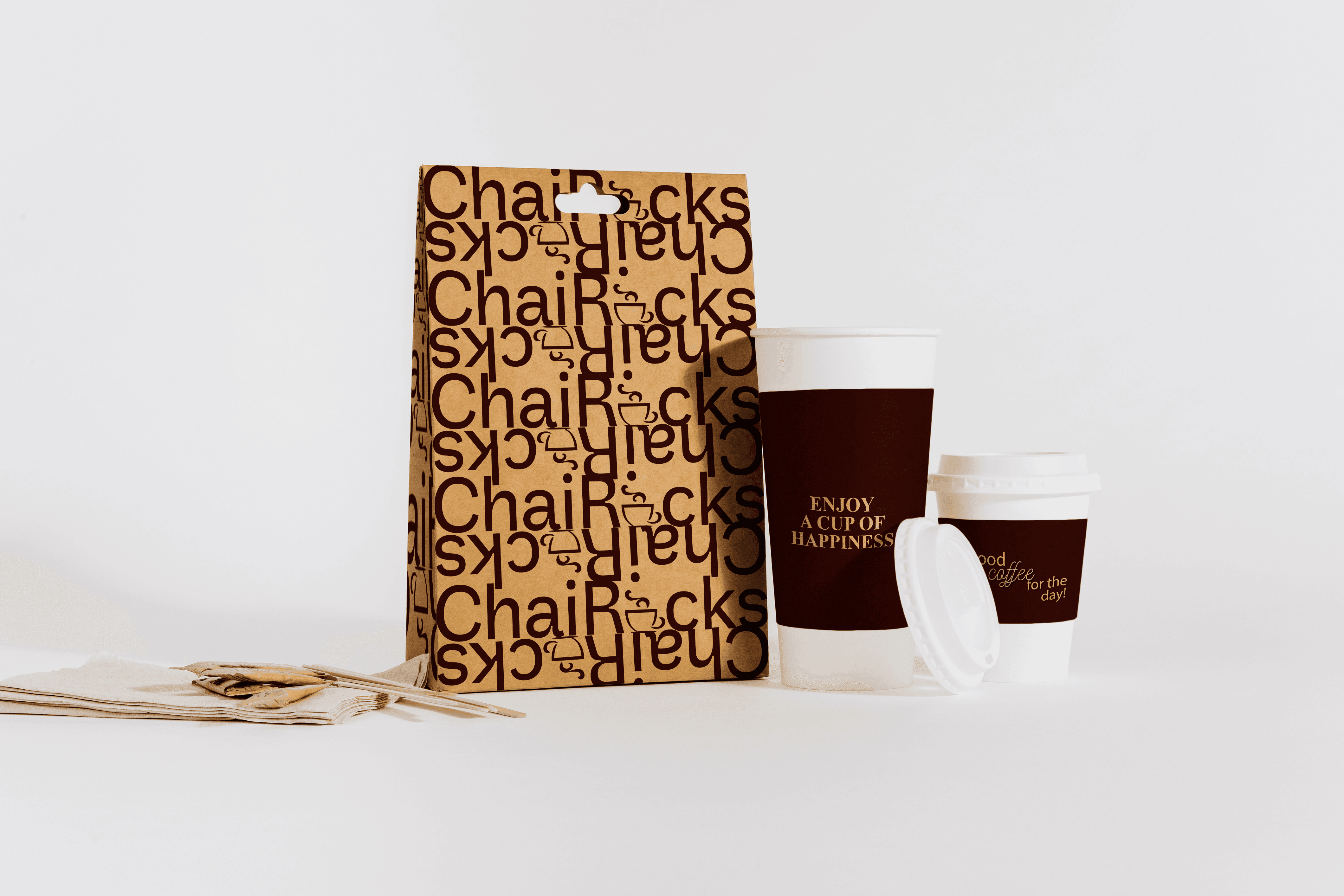
The logo is a clean, typography-led wordmark with a strong, confident presence.Instead of using obvious chai elements (like cups, steam, or doodles), the focus is on simplicity and structure. The capital “C” and “R” create a subtle emphasis, giving the name a distinct rhythm and making it more memorable.
The result is a mark that feels modern and scalable across signage, packaging, and digital platforms without losing clarity.
The palette is inspired by the richness of chai and café culture.A deep brown tone anchors the identity, directly referencing tea while also conveying warmth and depth. This is paired with soft neutral backgrounds to keep the overall look clean and premium rather than heavy or overly traditional.
The restraint in color is intentional, it keeps the brand feeling confident and not visually noisy.
THE COLOR PALETTE
TYPOGRAPHY
The typography follows the same philosophy as the logo: minimal and controlled.
A clean sans-serif typeface is used to maintain readability and consistency across menus, packaging, and communication. The simplicity allows the brand to feel modern while letting the name and experience take center stage.
THE RESULT
ChaiRocks feels modern, grounded, and approachable.
The identity avoids clichés and instead builds a more refined take on chai culture, something that fits both a casual hangout spot and a more design-conscious café environment.
It stands out through restraint rather than decoration, creating a brand that feels current without losing its cultural connection.